
Thursday, 22 March 2012
M&S TV advertisement
This is the TV advertisement that i put together to show what sort of things would be played when it comes to the in store advertisements, that would be played on the tv ads around the marks and spencers stores
TV advert...
These are for the work to be created into a TV ad for the work of the M&S tvs that are dotted around the stores


These three above are the first test strips that i managed to mock up, however i think that the text looks too compact in one area this makes you think about whats going on too much and doesnt have the effect that i am really looking for with this style of work.


These above are then when it was in motion, these worked aswell but still not to the same effect that me and steph wanted and this created some very crazy looking design work that could defiantly be improved.


These ten screen shots are ones which have the effect and the style that we wanted to make sure that everything works, when me and steph talked about it we decided that we wanted things to look alot more like this, we decided that we wanted the text to vanish before the rest of the work came into display, this made things look rather strong and made me think about it alot stronger.
Wednesday, 21 March 2012
Initial Photographs


These are some of the photos that were taken to show how they look however these could not be used on the final boards, we need to make sure these look alot more professional for these, so we will book out the photographic equipment and then take these shots so that we can make sure that everything is done correctly and how we plan to get things done for the final boards.
Sunday, 18 March 2012
Digital Design Nets
To try and visualise our net designs Steph produced some 3d Visual Mock ups, with this we could see what the constructed net would look like and see if any changes needed to be made. These could also be used as a proposition on our boards if we decided to not print, or have any problems printing.
Larger items, such as the overall stand which holds all the food items, is simply too large to print and create, so a digital mock up would certainly be appropriate. Along with in store promotion, we can't be expected to be allowed to stick our printed promotional material up and around M&S, so we need to take pictures in store of blank canvases or existing promotional material to overlay and alter them digitally to hold our own designs.


Larger items, such as the overall stand which holds all the food items, is simply too large to print and create, so a digital mock up would certainly be appropriate. Along with in store promotion, we can't be expected to be allowed to stick our printed promotional material up and around M&S, so we need to take pictures in store of blank canvases or existing promotional material to overlay and alter them digitally to hold our own designs.
Food Product Box

Display Stand

Store Front

In store posters

Thursday, 15 March 2012
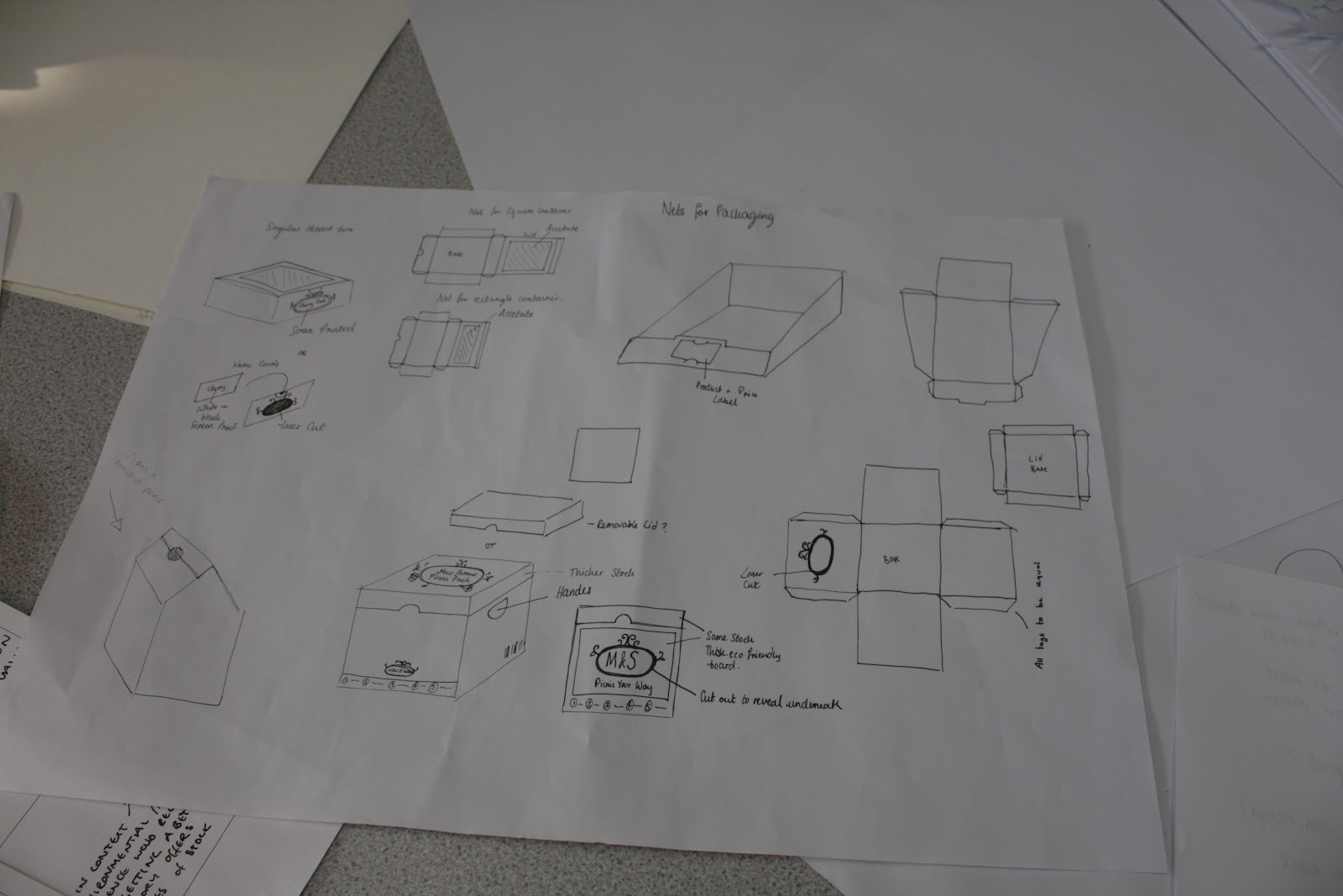
Design Sheets
Steph produced a few design sheets, putting idea to paper. This helped us to communicate the ideas in accordance to design that we had, and helped us to visualise them aswell.This also helped us to then get more ideas down on paper and show how we wanted things to look and progress further with the design work.

Wednesday, 14 March 2012
Display Net
We then designed the display box to continue the consistency of our products. It displays the food product item - providing information on its taste, for example. The colour chosen contrast to that of the smaller individual food boxes it would hold, just to differentiate the two as different, yet the similar and consistent colour palette interlinking the two.
The net was taken from the 'Display packaging' book within the studio, colour and shape was altered to our specific needs of the product so that everything can fit where and when we need it too
Our chosen stock will be strong enough to hold the food boxes, sturdy to the extent it won't break with the weight of the food. We would propose stock to be eco friendly and completely recyclable, to keep costs down we used stock found in the library. The print too would be eco friendly, possibly with Soy inks - The fact that stock and ink are eco friendly would be displayed within the inner packaging alongside the M&S logo.
Monday, 12 March 2012
Iconography
We were going to place icons on to show the seasons, these were some quick mock ups that i created however i think that these were left in the end because the actual words were wrote on instead and this made alot more sense to leave them off instead of over cluttering everything and making less sense rather then more.

Subscribe to:
Posts (Atom)