Tuesday 29 March 2011

What is a Line.


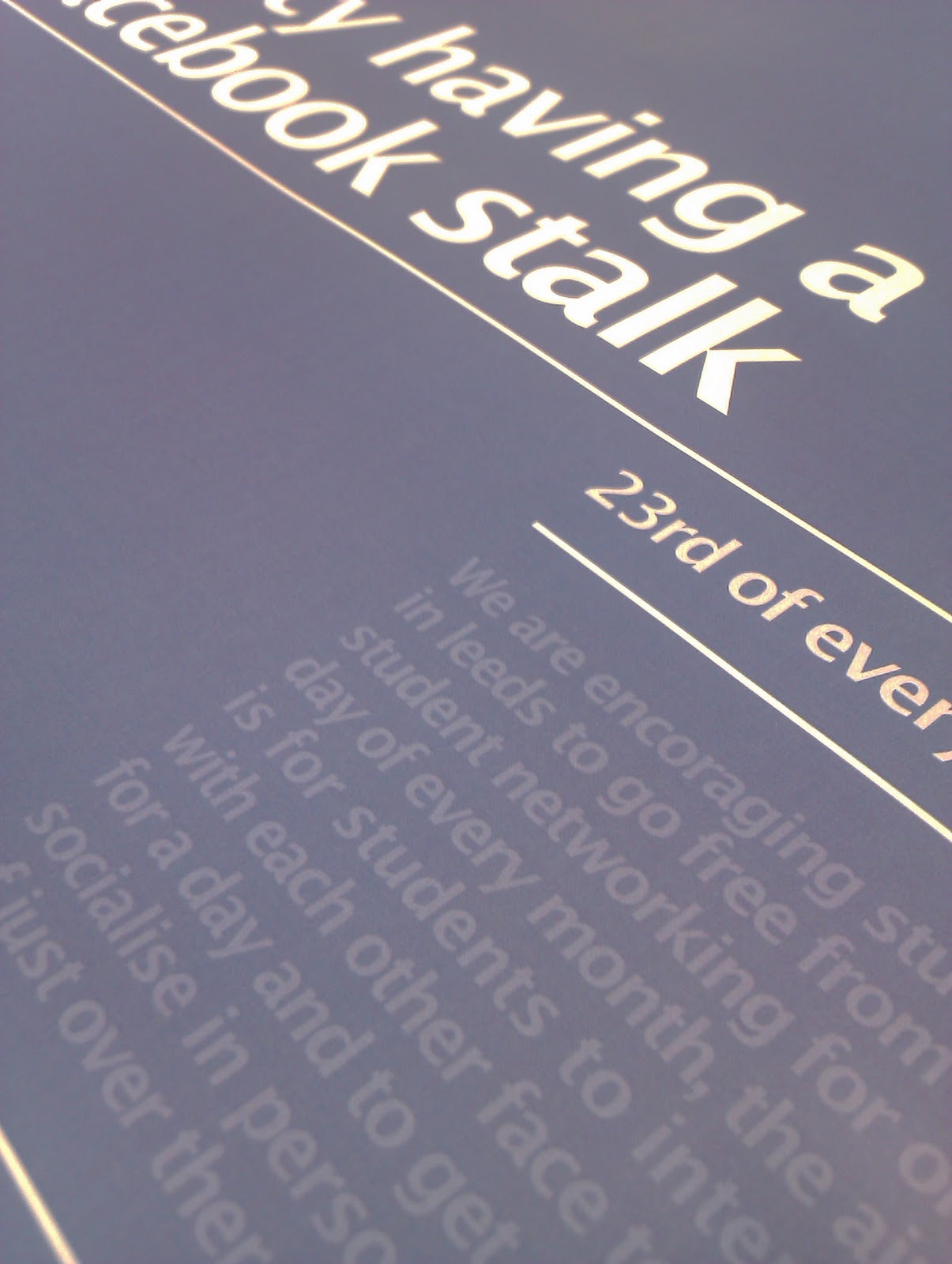
These are some of the preliminary drawings which i have created so that i can see how they will start to look when i am drawing further into the project. I will then need to change this style as of the moment it is not looking the best i could achieve for this.


I will now begin to change how i want these things to look by using a thicker style of pen so i can achieve the curves more and then makes it look more like what im wanting. The pen thickness could play a big part in how these turn out as i think that the end product could be a mixture of thick and thin lines. this would then create this to be alot more detailed so they stand out more.

Monday 28 March 2011

Opposites Re: Draft.


This above is the completed final outcome for what i wanted to achieve for the final design. This is a clean screenshot for everyone so you can see the final design.


This is the screenshot of me sending of the forms. i didn't get any email saying about it being handed in so this was the best way that i can prove how i have done this. 

Feedback from Group 5.


Very nice concept. 

Looks and works well.

Could be improved with an event of some kind so it has more to do with bringing people together. 

Looks a lot like Facebook so could be easily mistaken.

Could be changed to stand more alone and clearly distinguish what you are trying to define.


Sunday 27 March 2011

Final Presentation.


This is the presentation that we created for the final delivery of our project. this shows a brief understanding of how you got through the project and what decisions where made. To fully understand what we are aiming for then you need to look through one of our blogs. this would change how you can see everything and what you need to know of the difficult choices that we made to get the outcomes which meet the brief criteria.

Final Posters.


These are the completed final posters which we created. i think these work well and meet the brief to what we are needing to complete this for. 

Thursday 24 March 2011

Communication is a Virus: Website


This was the website design which we created, the way that we did this was to be able to then let people upload the things which they got up to on the days they had off from social networking, this then  got shot down as an idea after we had a crit with Jo, this was because the whole point was to keep people off the social websites and this was then allowing them to get onto the internet to use our website. it was very hypocritical. We then decided to get rid of this and start a new idea which led us towards the leaflet.

Leaflet and Flyer


These are the final outcomes for the Leaflet and the Flyer, they have a very clean cut way of looking at what you need to do and see in the campaign, these then can be seen from a range away, and you instantly think Facebook due to the colour and then when you read them they all make sense more. 

Printed Final Outcomes.


Printed final outcomes for the posters, leaflets and fliers. 

Re-visited Design Boards.


These are the new boards which deliver the work more of what we are about and how we wanted to show the concept, content and method of delivery. these are a little more standard than the other boards as these are only for our eyes so we didn't feel that we needed to print in a large colour palette.