Friday 30 November 2012

Business Cards


These are the first layouts for the back of the business cards, this was something that proved rather challenging, due to the amount of information which had to fit on there, normally it would be difficult to fit just a single persons information on there. This time i had to manage to fit two in a style that reflected what our company was trying to achieve. 


This is the final design of what we wanted from the business card, we managed to fit the information on each side of the business card, however down the centre it would be perforated so that if someone wants to get win touch with us, the person can rip the card in half and then it can spread twice as fast. 

We felt this was a nice extra for the concept of social spreading and trying to get our company name known as much as possible.

Thursday 29 November 2012

Final Photographs


These are the final designs which i created for Dare Headingly or the project know as Grand Opening. This was something which the overall design has worked really well for what i wanted, however there are somethings that i didn't fully achieve and i wish i had more for it, the way in which the final outcomes where photographed.

I had some really successful editions of it but then on the other hand some failed and didn't give me that style which i wanted really, however for the project overall I'm happy with my results and the range of products i managed to conduct together. 

Social Networking


Charlie managed to set up the social networking sites, this give us something so we were able to communicate better with the public who are wanting to search and keep in contact with us. 


These are some of the comments that people have left on our Facebook page, we soon are going to be able to create a twitter feed and this will us to have even more contact and get in touch with the possible customers who don't use Facebook. 

We are also in the creation stage of setting up a big cartel so were able to make sure that we can sell the clothing in the best and most professional way.

Friday 23 November 2012

Photoshoot of printed


These are just some samples of other printed pages, then your able to see how much the type and image will play in unison with each other.

Printed Posters


I managed to get two posters printed, and they came out perfectly, the bottom poster was printed in the print dungeon as there was too many colours to be able to screen print, lining them up and getting them all perfectly in line. 

The top image was simply screen printed onto a red piece of card using a mustard / yellow which is highly contrasted towards the background colour. I will hopefully be able to get a website set up so i can start to display my work and then start to distribute them in the best possible style to represent myself as a designer.

Tier Effect


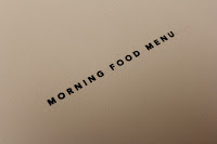
When the menus are placed onto each other, you can see that they have a step up formation so each menu is visible that they are different and can be seen as a step/grade apart, to make the most of this you can see what is wanted. The red of dare and then the red elastic band make a huge change in the scale of things and how i wanted the final design to work with one another.

The other way this could work would be if i were to have each of the menus a slightly changed colour so they could then link together in that format, however i think there are better things which could be changed to have the same effect without looking too obvious.