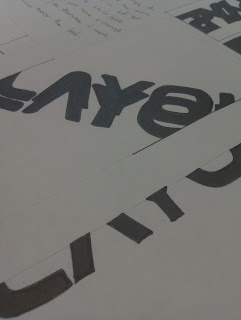
These are the work sheets which i have produced for the Opposites brief, i think that the way in which i have created these look better then the other designs which i created on the computer. However i think what i have produced for the final outcome answers what i needed it to ... so i will use this for the outcome. This is proof of the thirty sketches i have done!
I then got the idea that you could link all three of the posters together so that for the word to be legible you have to have all three together but you cannot read that word when you take them apart.
This design below could be a possible change for the final outcomes which i have created, the way in which it could be split into three different posters, could then change how all of it links together, this then has the eye catching way of working and the words underneath show the underlying meaning of how it can be illegible.
This was the first idea which i created for the outcome of what i am wanting for the final outcomes, however i think that they still remain to legible so i will have to try and edit this more until the legibility becomes almost unreadable, this will be shown below.
These are some ways in which the type could be less legible, the type placed backwards and then over the top of each other, this makes it look almost like a complete new sort of language, its totally illegible.
By changing the way in which the text can be read changes the whole meaning of everything. the way in which the text can be placed together will then make things look alot different, the best way to do this was with illustrator. The text can be changed through the modification tools and this would then make a strong design concept and outcome for the overall outcome.


No comments:
Post a Comment