Thursday, 3 February 2011

CD Packaging Designs.


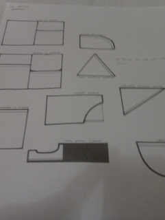
These sheets are the initial ideas for the packaging. There are created from a mix of all the different sections which i needed, i can then work from these and create some mock ups on illustrator to then design what i want them to look like. If these are successful i would be able to then create physical mock ups and create a strong outcome which i design onto to create the final piece.


Simple fold design where the cd can sit in the centre of the area and then have the packaging close up around it. This could be a possible option for the cd casing.


This is a similar style of design but i think this has a more modern edge and more area work space to work with. The sides can then have stuff placed onto each of the sides. however i don't know how secure this outside shell would be as it could just flop open if not sealed correctly.

This is a more advanced way of creating a cd package, but it still could be rather simple to do if i could create a net for it. The way in which the CD would sit in would keep it safe and also show of the graphic design skills to make it eye catching and more demanding if it went out into distribution.
This would fold up rather nice, the left hand side part would create like a sleeve which could then slide the cd out using the section cut out to create this then this section folds into the part on the right, you can then fold the top section down and this would protect the whole outcome. 
This slips inside the outside case, this would keep the CD very safe although i think the construction of this case would create a few problems for me to design as my 3D design skills and construction skills are not as good as what i need them to be. 
This design replicates a wallet, the CD slides inside then you can fasten it shut, this is like the very simple design i created at the top but this one has a little extra flap on which can then be used to keep them all safe and to stop them falling out. 
This is a sleeve which can sit a CD inside and then close over to keep it all secure. 
This design is very simple and works well to create a strong but simple design, however i have got the shape a little wrong and think i need to adjust it a bit to make it work on a better scale so that the CD would not fall around inside the packaging. 
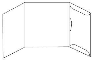
This design is rather nice as the part on the right hand side could hold the CD in there and then the centre would have the design onto it which could tell you alittle more information. this would make a nice outcome and i think if i could design a strong package for my work then this would make it look better as a project. 
This design is a different to the normal which you would find, it could work but i think there is better designs out there and more suitable for what im wanting. 
To simple and doesnt carry the message which im wanting, looks like something you would find in a computer box to carry the reset disk.
Again this is to simple, the design is just a sleeve with a hole cut out of the centre so you can see what style of CD it is.
This is similar to the sleeve one above but more interrogate designs would be cut out of the centre of the design and then you would be able to see what it going on but in a more fine artist style of way, i don't think this carries the message which i am wanting best, 
This design is very nice for what i am wanting the way that you could fit a double CD into the package would make a much more strong design and the folded double up layer would make it feel as strong as i need it to be for it to carry and deliver the message strongly.
I think this design over complicates things for what im wanting and how i need it to look, also i don't need it to carry that many different disks and i don't want it to carry a memory stick in the centre, i could always change the package slightly to make it fit my criteria better but still wont be best for what i need. 

Very simple sleeve style, the CD would slide into the top but this wouldn't be as effective as the CD could slide straight back out if it was tipped upside down. 


I then  created some of the designs for what i needed to see which would work best for the outcome that i need to hold the CD design, i think that this will then say which i think could work best for what i need.

________________________


The first image above is the simple sleeve but i dont think this works best for what i need it to show for the outcome of this design and how i would like it to present the information.


Above is the sleeve where the CD would slide in, this design was based on a bag design on how you could close it to stop it falling out however i dont think this could be easily produced to best fit the criteria which i am wanting to meet.


This one can fold in from all four angles, i think this could work well but still not to the standard of what im needing for us to be the best style and the packaging is very delicate for the CD holder. This is another reason why it will not work as good as it could.


This design above would be fastened and then there would be two CDs held within. One on each side, this would then be a nice design but again not for this project, i think that there is better designs out there for what i am needing, as this one could hold too many CDs as i only need one space, i could adjust the design to fit this criteria but i dont think this would be the best answer where i could use a design which could meet its needs better.


I love this design, the way in which the sleeve can hold all the information and the disc in a strong fashion, this also looks neat and compact. This is defiantly a strong choice for an end result.


This also is another strong design which i think could work strong, The way that the information could be delivered could work well for the end result and then i would be able to hold the single CD  in  the centre of the packaging which would well with what im wanting.
Again when all folded up the design is rather compact so its easy to deliver and makes it work from how the message is to be delivered.


______________


After seeing that this one below works, i think i would like to keep the package clean and simple but still keep the design clean cut, i think that this design could answer the best for what im wanting for the design, this is easy to design and creates the style which im wanting for the outcome of my work. 


These above are just some samples of what the final image will look like, some of the images are upside down cause thats how it needs to be for the Net to be successful.

No comments:

Post a Comment