I wanted to add a price list for the printing methods so you can see how much it will cost you to get things ready and printed, these can cost a lot unless you take your own paper which is then described in the little chunk of text on the outcome. however i think that this looks a bit bland on how you can see it about, i think that by adding some colour to this it will brighten it right up.
This is the same image as above but this is with the guide lines on so you can see that everything is in line and straight forward, still the colour is needed to make this more eye catching and work better.
This now works alot better due to the colour. and all the guide lines have been removed so you can get an appearence of what it looks like, when printed onto the correct stock this should look savage and really stand out from the other black text around the page.
This text is just to describe what is going on and how you would like things to go and work out for you, this however needs to be laid out a lot better as this doesnt work when its just placed on there without any consideration. Work must be stronger and have more impact on what is needed to become a strong final outcome.
This is stage one of me taking into consideration of the layout, also i kerned this so it can sit stronger in the bottom corner.
I then added the line above the text to make it fit in with the rest of the outcome, this seems to be the trend within this final design.
This is what it looks like so far without the guide lines.
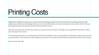
I then wanted a block of text to describe everything that is going on and how i can best describe it all, these are very simple and just gives a basic overview of what is happening. Although i think that when this is all correctly kerned and sat in the correct spacing this will make that section look more complete.
This is that section with everything in the correct spacing and how i want it to look but it still has the guide lines on there and this is not going to help for visual look of it all, i think that by removing them guide lines and then seeing what it can look like without will tell us what we really want to think about this design.
Here it is without the guide lines, im happy with how this looks and works as a design outcome.
I however changed the text which was sat to the bottom right of the price list as i didn't like how it looked and sat within the work, i then kerned it and make it look like it was supposed to be sat there, and i think that the work has benefited from this. This now works a lot stronger than the previous designs.


No comments:
Post a Comment