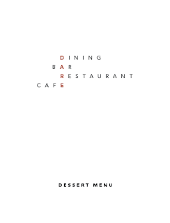
These are the final outcomes for the menu designs, this is something that i'm really happy with the final outcome. The way that the logo sits perfectly the same on each of the menus makes this work that little better.
The way that the red line, is now down the side of the page allows the headings to be able to be more dominant in the design, this then allows for the space of hi-arachy with certain aspects of the type.
The drinks menu was much harder to type set, this was because of the large amounts that i had to make fit into a certain space, i wanted each type of wine to have its own section then try to get the child friendly drinks on one page then the alcoholic on the other, this didn't work as well as i wished for it to do, but i still managed to get it laid out in a manner of which answers the briefs problem.


No comments:
Post a Comment