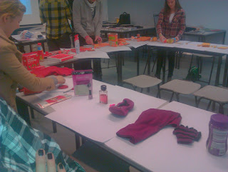
These first images are documentation as we placed all of the coloured objects that we brought in as a group in the colour circle which makes things link together and make up the primary, secondary and tertiary colour spectrum. This task was harder then expected but we still managed to pull it off, it would have been easier if there was a specific colour bit the items which we brought in ranged in tints, shades and tones, which made it a lot more difficult when coming to selecting the right spot for them.
This second selection of images are all the ones which i chose to find the pantone colours in the swatch books which we have in our studio, all of which have there own tones, shades, and tints. these were in a range of different swatches ranging from uncoated to matte.
 |
| 232U - 8pts Rhode Red 50% - 8pts Trains Wt 50% | |
 |
| 2705U - 1.5pts Violet 9.4 - 0.5pts Pro.blue 3.1 - 14pts Trans Wt. 87.5 - 40% tint |
 |
| 176-10 - Cyan 18 - Magenta 100 |
 |
| 2105U - 1.5pts violet 9.4 - 0.5 Pro.blue 3.1 - 14pts Trans Wt. 87.5 |
 |
| 176-3C - Cyan 60 - Magenta 70 |
 |
| 2735U - 12pts Violet 75 - 4pts Pro.blue - 70% tint |
 |
| 235U - 16pts Rhode red 88.9 - 2pts Pantone black 11.1 |
 |
| 171-1C - Cyan 60 - Magenta 100 - Key 40 |
 |
| DE 177-1C - Cyan 80 - Magenta 100 - Key 10 |
 |
| 257U - 1.5pts Rub.red 9.4 - 0.5 Pro.blue 3.1 - 14pts Trans Wt 87.5 |


No comments:
Post a Comment