Wednesday, 29 February 2012

Boards of Creative Direction...

We had a crit that was basically to show the other students the work that we created and how we wanted things to look and what the message was that we were trying to communicate, this was done through the use of boards, these show the the message and the ideas that are going to drive our work. 

These are such a simple way to be able to tell the message however i think these were the best way to be able to get this message across in the best light. The 5 boards were a good way to do this and i think these will be used again to deliver this message.


Tuesday, 28 February 2012

Problems this brief entails

These are some of the problems and all the issues that the brief entails when you look deeper into it, these are the problems and the solutions of everything that needs to be done so that we can finally get everything 


Problems to solve:


- Appeal to young, working class families
- How do we entice / motivate families to leave the house for a picnic (if thats what we are trying to achieve)
- How we stay in keeping with M&S branding and style
- Try to appeal to range of ages, sex and interests
- How do we communicate a season in the form of food and packaging
- How do we avoid cliche's, M&S standard audience, Target our new audience


Target Audience:


- Young families
- Working Class
- Those who wouldn't normally shop at M&S


Tone of voice:


- Fun
- Fresh
- Seasonal
- New
- Special
- Treat
- Sweet
- Exciting


Competitors / Similar Market:


- Sainsburys meal deal: Offering a main, side and drink for a small price. Sainsburys have a wider market than M&S, its associated with the people we are trying to target. They also offer picnic like platters for lunchtime - a wide selection of sandwiches within one box at a very reasonable price.


- Asda : Offer oriental, Mexican ect style platters and selections you can purchase - The packaging reflects the style of a metal dinner tray; dividing the food into sections.


- Tesco: Offer seasonal fruit lunches, not very solid as only one type of seasonal products exists. Again, targets audience we aim to direct our product at.


Design outcomes / Processes:


- Eco-friendly
- Biodegradable
- Hand rendered type
- Slick layout
- Using recyclable materials
- Possible screen printing
- Die cutting
- Infographics


Design outcomes in detail:


Packaging


- Quirky, informative, playful packaging. Designed to allow a person to select a range of different products, for them to fit appropriately into our sectioned packaging box.
- Needs to evoke the picnic idea and culture
- Appearance will depend on season
- new design brought out seasonally
- Easy to use
- Convenient
- Quick to select and place products in box
- Consistency between food product packaging
- Info graphics clearly communicating how the picnic pack works
- Available
- Fun
- Informative


Logo


- Must use M&S logo
- WIll adapt colours to season


Serviette


- 'Family friendly' - of good quality, must be able to do its job, not just to look 'pretty'
- Screen printed within logo and slogan
- Recyclable
- Consistant with packaging
- Simple

Cutlery


- Recyclable
- Re-usable (not plastic, strong enough to be used again)
- Simple
- In keeping with packaging
Digital promotion


- M&S TV Moving image
- M&S Tiny TV instore promotion - Moving image


Print promotion


- Series of posters communicating picnic idea and tagline
- Placed in suitable areas relating to the idea of a picnic. E.g A riverside
- Photographs of 'the perfect picnic' setting, visually promoting idea
- Pricing labels
- In store banners

In store promotion


- Typographic Murals?
Tagline


- Fun, convenient, ethical, bringing families together
Store dividers


- Large dividers within aisles sectioning off the picnic pack food products, to easily communicate to customers the foods which can be chosen from.
- Array of selection boxes, of different sizes and shape showing the range of food products you can choose from to go in your pack - Visual selection
- Moveable, recyclable, Large stands, holding either the baskets themselves or food products. Consistent with packaging design and existing M&S stands


Campaign


- Create a campaign to promote our product, using a similar direction as that of existing M&S Campaigns.


Mailshots


- To promote picnic pack
- In keeping with packaging design

Saturday, 25 February 2012

Primary Research

There is a large selection of foods that are out there in terms of the platters and other such products, i feel this is something that needs to be looked into and then we can visit what is going on and how we want to change the things that we are doing. This will also give us a look at what sort of foods get put into these picnic packs and how they are going to look when they are all completed


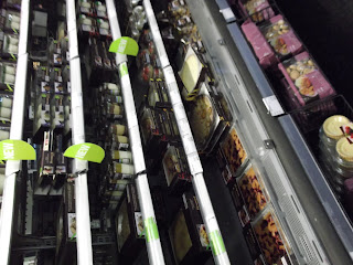
These are placed around the entrance to Marks and Spensers, this allows them to see what sort of food they will be buying when it comes to going into m&s so they can see what style of eco friendly products they will be buying into


M&S TV is something they have used for a long time which shows how they want to create the work and what they actually want to say to the customers, this gives you a view into the way in which there food has been picked and how they want things to work out over all. 


This is a very nice way to package which gives off that oriental style package view of it all, i feel like this is something that could be implied when it comes to our style of package and what we actually want to get from everything. 


Again store layout was important in promoting the above product. For a certain price you can select a few relating items - for instance - Chinese pack, Pack of crackers, Drink, Soy Sauce, Chilli Dip. There were similair selections for the other packs available. This would be a brilliant idea and in-keeping with M&S if we do the same.


The only dessert pack I came across was a very bland, 6 piece selection box, just showing there is a gap in the market and in M&S for our new innovative product.


An easter display, holding hot cross buns. Something we could potentially package for the Spring picnic box. The stand holding the food products here is again something we could do, something of a similar purpose and size.


In store design, a divider sectioning off food products. Something else we could try to do and design for. this would give us that little edge on the market and draw attention towards the final design and show how we want to and what we want to be achieving and show our ambition 


We then looked into other stores of how things are going to be done and what we want to see from them and how we could then use there ideas to get our products across in a better light 

Thorntons


Sainsburys


Friday, 24 February 2012

Finding a Partner...

[create the posters and post onto blog to show how and what we did to find a partner]

Tuesday, 21 February 2012

YCN Brief Overview

Here is where i looked into the sort of briefs that i wanted to do for this collaboration brief, i feel that it has a very simple style about it and this is something that i think could benefit me alot when it comes to actually choosing one to do. 


If i have a look into what i want to do now then this will give me the final look on whats going on. 


These three are the ones which i dont think i would be interested in doing as i think that they have a very simple and un-interesting brief to them, they are very open and dont really give much room for my creativeness to come out i dont feel.


These are the three which i think are more fitting to my style of work and these are the ones which i could create a much more varied style to what i need to do for them all, i think that with the style of work which i want to get done these will be fitting 


Wednesday, 8 February 2012

OUGD202 SELF EVALUATION


Packaging Development...

The development of my final outcome for the packaging is something that i think could really make or break the final view of my product, i think that this idea could really set it off as it links loads of parts of survival aspect to then achieve what i want to and deliver the message in the best possible light...


Survival foil blanket used to keep you warm in the wilderness


At this point all the measurements are complete and they have the style and the look of what i think is necessary to make a successful packaging.


This is then wrapped in the survival foil blanket to give it that style of outdoor living and have it so its instead of just having card


This is the folded achievement of what i want things to look like with the disc... and yes, the disc is a 'snug' fit.


I then sprayed my title onto the outside of the packaging and also my name and 'ougd202' onto the inside sleeve, this has worked so much better then what i wanted it to, this is because the section of the how to survive in the wild 'ow to sur'  this has the effect that my idents have so i think that it all links together rather nicely 


The string was just that little added touch which i think could impact on what i wanted these to look at work along as, these are part of what my initial ideas where but in a much more simplified way 


Also scratched the outside as it looks too clean and precise, i wanted these to have that dirty urban style about it.