These are placed around the entrance to Marks and Spensers, this allows them to see what sort of food they will be buying when it comes to going into m&s so they can see what style of eco friendly products they will be buying into
M&S TV is something they have used for a long time which shows how they want to create the work and what they actually want to say to the customers, this gives you a view into the way in which there food has been picked and how they want things to work out over all.
This is a very nice way to package which gives off that oriental style package view of it all, i feel like this is something that could be implied when it comes to our style of package and what we actually want to get from everything.
Again store layout was important in promoting the above product. For a certain price you can select a few relating items - for instance - Chinese pack, Pack of crackers, Drink, Soy Sauce, Chilli Dip. There were similair selections for the other packs available. This would be a brilliant idea and in-keeping with M&S if we do the same.
The only dessert pack I came across was a very bland, 6 piece selection box, just showing there is a gap in the market and in M&S for our new innovative product.
An easter display, holding hot cross buns. Something we could potentially package for the Spring picnic box. The stand holding the food products here is again something we could do, something of a similar purpose and size.
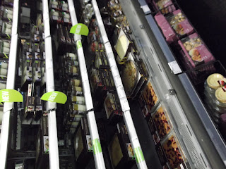
In store design, a divider sectioning off food products. Something else we could try to do and design for. this would give us that little edge on the market and draw attention towards the final design and show how we want to and what we want to be achieving and show our ambition
We then looked into other stores of how things are going to be done and what we want to see from them and how we could then use there ideas to get our products across in a better light
Thorntons
Sainsburys


No comments:
Post a Comment