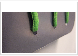
The above images are ones which are just a simple design which really think about the way that the text and the image will play around with each other, i want to keep this rather minimal as i feel that is how my designs have been so far. I think These are working so far and i need to then place the text on these below and pick one which works best for my designs.
This is my favorite so far, but ill develop more as i go.
This design doesnt have the same impact as the one that is above, this for me looks mroe like a letterhead and something that doesnt have a strong a feeling and impact as what im wanting. so unfortunalty this will not be used for my final design.


No comments:
Post a Comment