This is where i have posted all the design sheets that i have completed for this project, this for me is something that i think will work rather well to show the development that i have gone through for each of these, these also then allow anyone who wants to know how i came to certain decisions and made certain choices...
These are the intial ideas which i think could work well and get the project of too a good start...
These are the top heading parts which will link everything together so that i am able to see which i need to do to make the most of things such as these, The best way for me to show these would be to post another section when colour has been added to these so that i am able to see how these will really work together.
This is the design process for the cross country section where i was trying to aim to achieve a design which gives the style and effect of what you would think cross country running would be like, this is not one of my favorite designs yet it still has a strong effect which can relate strongly to "my good"
The double yellow line idea links in with the strong way in which i thought they could relate to the double yellow lines you would find on the road.
This idea came for the double page spread, cause i thought the concept of the colour of each ring could then link them together so that each colour then could be a different DPS so i would then be able to link that into the project a little more.
These two images, above and below are where i have started to design the two main sections of my work, and the two that i think could work the best. These both have the same sort of style of track which will be running around the outside of the net itself, however i think that when it all comes together they will become more clear and deliver the perfect message.
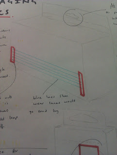
These are both nets which i have found from the books which i look into for standard nets. the black pen marks on the image below and then the orange marks on the one above are both the sections which i have changed so that i am then able to take these ideas forward so that i can produce the best style of work for what i need to achieve.
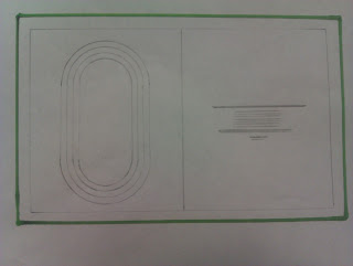
All the images above are the editorial layout designs which i first looked at, this was a way to see which i wanted to progress with and which i could leave where they were. however the ones which are highlighted in green are the ones that i think had the best chance of working.
I think the image which sits at the bottom is the one which i think would most influence the work and the style which i like the best.


No comments:
Post a Comment